
Compass Counseling, based in New York, is a dedicated mental health practice specializing in therapy for adults and college-age individuals. With a focus on providing compassionate and effective care, Compass Counseling helps clients navigate life’s challenges with clarity and confidence.
As the practice continues to evolve, the leadership team reached out for a complete rebrand to modernize their visual identity. They wanted a refreshed look that would resonate with their client base while maintaining the professionalism, trust, and guidance that define their practice. The goal was to create a brand that feels both contemporary and inviting, aligning with the needs of the individuals they serve.


Compass Counseling's previous logo did not effectively reflect the high-quality care and modern, evidence-based practices they implement in therapy. The outdated design failed to capture the professionalism and trustworthiness that are core to their practice.
Additionally, the logo suffered from inconsistencies in typography, with mismatched fonts and varying weights that disrupted the overall cohesion of the brand. Rather than attracting their ideal clientele—adults and college-age individuals seeking expert mental health care—the old branding fell short in conveying the warmth, expertise, and guidance Compass Counseling strives to provide. They needed a refreshed, contemporary identity that aligned with their mission and the people they serve.


To create a timeless and modern brand identity for Compass Counseling, we focused on simplifying the logo while maintaining its core symbolism.
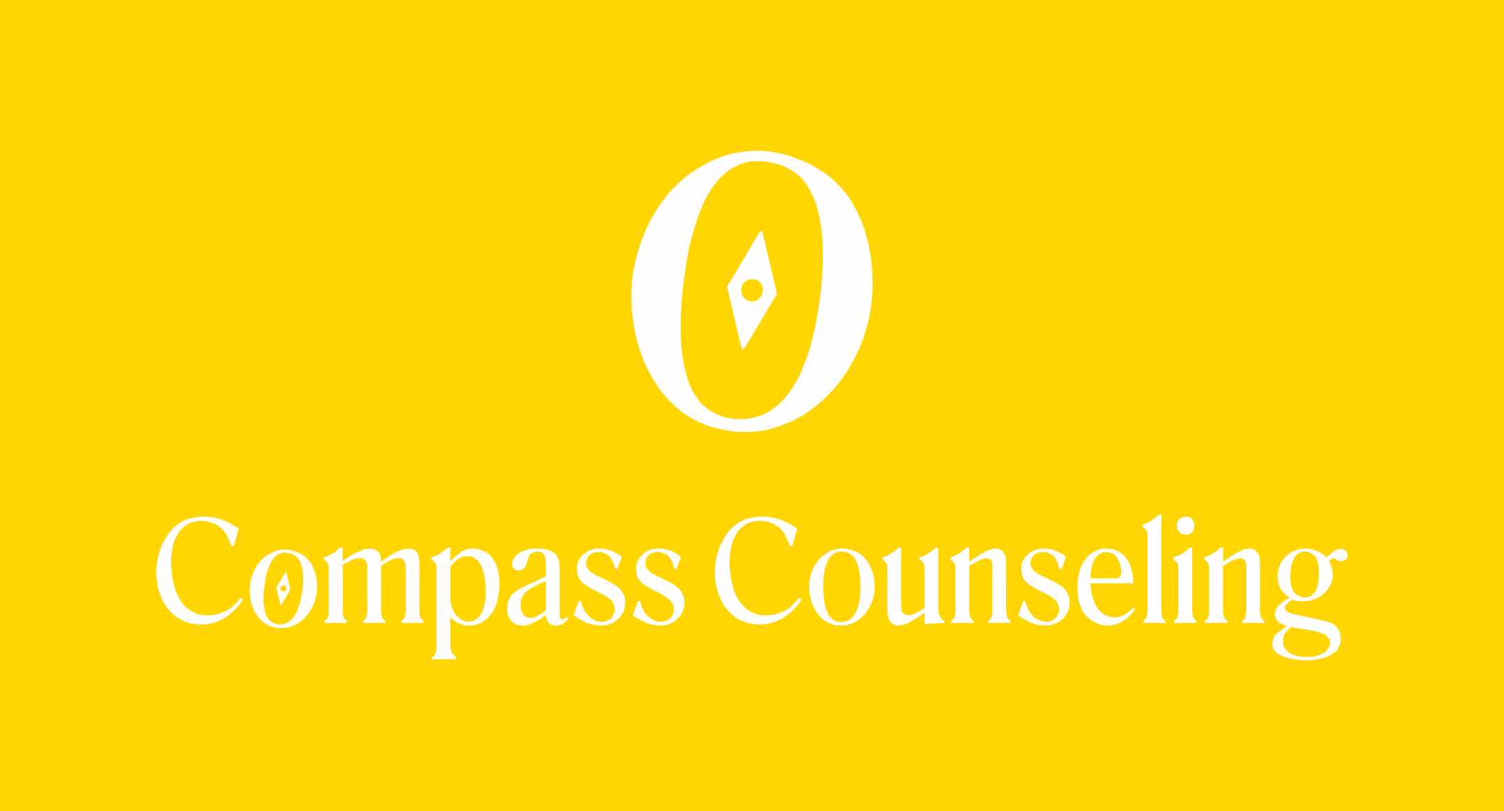
🧭 Refined Compass Icon: Instead of a complex and outdated design, we deconstructed the compass to its essential elements—representing direction, guidance, and stability, all of which align with the practice’s therapeutic approach.
🔤 Typography Integration: To ensure cohesion between the icon and text, we incorporated the letter “O” from the practice’s name into the compass design. This subtle yet intentional detail connects the logo directly to the brand while reinforcing a clean and sophisticated aesthetic.
🎨 Modern Appeal: By streamlining the overall look, we created a logo that is sleek, contemporary, and more appealing to their target audience—college students and adults seeking expert mental health care. The refreshed design now reflects the professionalism and evidence-based approach that Compass Counseling embodies.
The result is a logo that is both timeless and adaptable, positioning Compass Counseling for continued growth while making a lasting impression on potential clients.
.svg)


